Fun vs Minimal
While some people loved the new Stampy logo, others felt it was a bit too “cutesy” and inappropriate to represent a serious topic as AGI safety and existential risk to humanity. So, an alternate website was launched with the same informational text content as stampy.ai but without the imagery. Between the various sites, the analytics indicated a healthy average of a few thousand visitors each week. We began exploring a more minimalistic logo for these alternate sites.
Generated Alignment
With the idea of “alignment” and “seriousness” in mind, we first used namecheap’s Logo Maker to generate some basic ideas. After answering a few questions on our preferences for font and logo styles & colors, we gravitated towards indigo-bluish colors, some gradients, and parallel lines to indicate alignment.

Puzzling Challenges
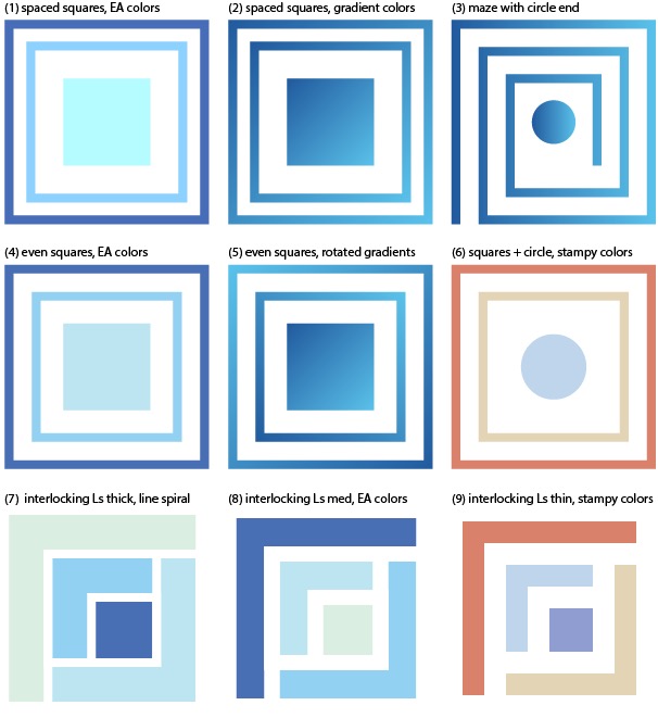
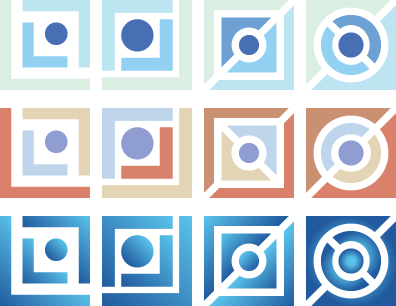
For the next iteration, we brought in some additional ideas of mazes or puzzles, hinting at the idea of solving challenging problems. Someone suggested using concentric circles or colors from branding within the Effective Altruism movement.


Easter Eggs
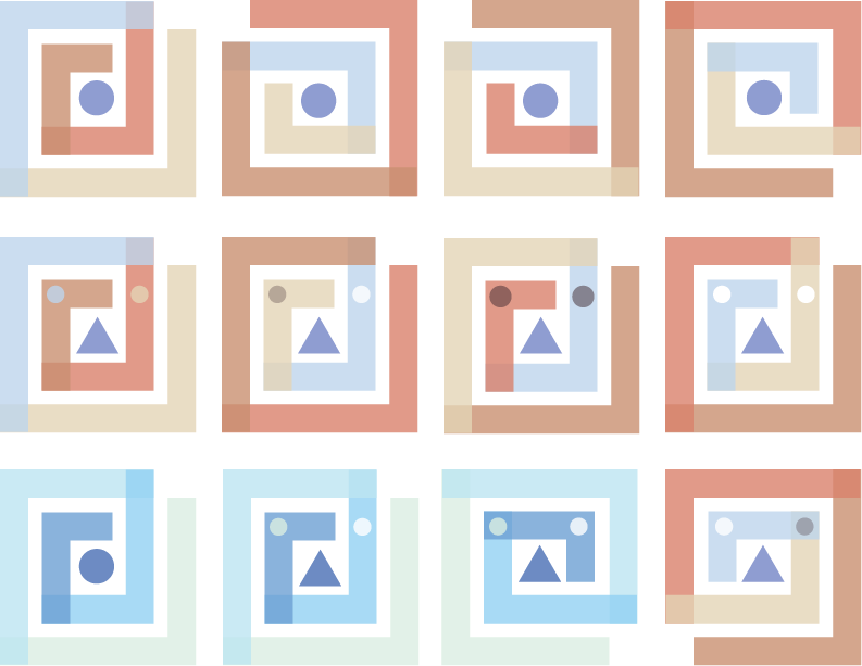
In our final rounds, we experimented with some Easter eggs, incorporating aspects of the original Stampy colors including elements of a face and stamp.

Finally, introducing our new alternate, minimalistic, sorta-serious logo… It’s a puzzle. It’s a maze. It’s a stamp. It’s face. It’s anything it wants to be! Do you see all the possibilities?
Take a look at aisafety.info with the new, minimalistic design.
